Anna’s Taqueria® Kiosk: Táctil Fácil™
Project Info: Sp22-ENP-0166-02-Computer Interface Design, Individual Class Project
Project Type: Ordering Kiosk UI design, Hypothetical Consulting Project
Project Timeline: 1 week, fast-paced (January 2022)
Skills and Techniques: Ideation, Wireframing, Rapid Prototyping
OVERVIEW
Brief: Develop conceptual sketches for Anna's Taqueria's ordering kiosk Táctil Fácil's user interface. For this initial design phase build out the flow to order a single menu item, but ensure the design is flexible enough to facilitate ordering multiple items. Users will order their meal using a Square Stand kiosk with a 8.3” iPad Mini. User tasks include: Viewing a menu of options and prices, ordering a food item, specifying the size (if burrito or quesadilla), choosing cheese, rice, and bean options, choosing toppings, paying for the product using credit card slot and chip reader and receiving their order number.
The UI should be intuitive to use and suited to children who can read and adults of all ages. It should not rely too heavily on written content and should enable customers to order a product quickly. The UI should also be Anna’s Taqueria-branded, and have an authentic and home-grown feel, matching company branding but not a scaled version of the website.
Background: Anna's Taqueria is a Mexican restaurant in Boston that serves tacos, burritos, bowls, & quesadillas all made fresh daily.
PROCESS
Stage 1: Discover
Branding: Website Style Elements
In order to retain the branding of the site in the redesign, I first looked at style elements like hex color codes, fonts, and padding. Using the Chrome extension CSS Peeper was helpful in inspecting different parts of the website.
Anna's Taqueria as a brand conveys an authentic and homely feel with a playful look. Pale yellow provides warmth and sincerity and conveys an inviting feel for the users while burgundy on the logo is a contrasting color that is bold and appetizing. Dark green and burgundy are both used for text and navigation titles on the website.
Stage 2: Define & Ideate
Aim: To enhance the ordering experience and simultaneously increase efficiency and operations.
User Navigation & Ordering Experience
I first thought about how the user experience of ordering food from a kiosk looks like and visualized on a simple diagram on the right for user navigation.
The overall ordering experience should be visually enriching, interactive, and engaging to best reflect a real ordering experience at a counter with an actual human. Additionally, visual feedback and progress tracking are important parts of the design to hold the entire user experience together.
Design Considerations
visually aesthetic with less emphasis on written content
reflection of the brand’s traditional identity while maintaining simplicity
maintaining brand colors: pale yellow as the main color for the background, red burgundy for highlighting important information and dark green for buttons
use of high-quality food visuals to enhance the look and feel of the ordering experience while reflecting the fresh ingredients and authenticity
inclusive design approach with accessibility considerations that include size, color, and contrast to adapt to the needs of people of various ages and abilities. Anna’s Taqueria has a diverse customer base and it is important to meet the needs of everyone and maintain a welcoming atmosphere.
Font: For simplicity, a single font style with a clean, sans-serif aesthetic that gives a minimal and modern feel, which also achieves high readability and makes the design more accessible.
Text size: Based on accessibility typography guidelines, an effective size of at least 16px should be used to ensure that the text is comfortable to read for the elderly and people with visual impairments.
Color: WCAG (Web Content Accessibility Guidelines) compliant color themes should be used and with a good contrast ratio to ensure text on the background is easy to read and color-blind safe.
Language: Offering a variety of language options to choose from allows all users of diverse backgrounds who speak different languages to understand and navigate through the UI. In terms of the tone of the language, conversational and friendly language will engage the users and reflect the brand identity.
Stage 3: Develop
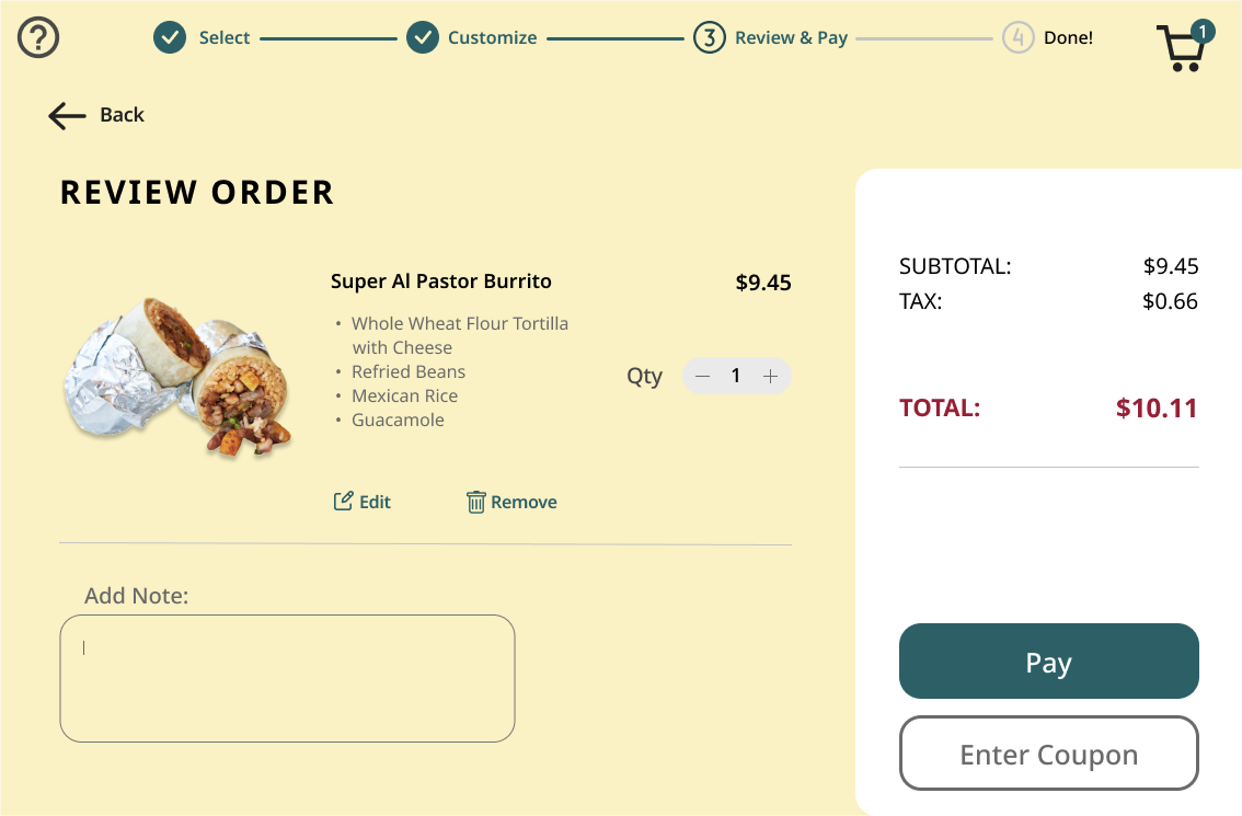
Below are 7 high fidelity screen designs for a variety of user tasks: Viewing a menu of options and prices, ordering menu items and customizing, paying for the product using credit card slot and chip reader, and finally receiving order numbers. The user interface reacts and responds to actions of the users through strong visual communication.
Reflection
Doing this project was fun and experimental for me considering it's fast-pace (1 week timeline) and non-typical screen format being a kiosk with Ipad dimensions. It was interesting to think about and do some research into the ordering experience of the user, the brand image and feel, as well as the context. I realized the importance of different types of audiences from different backgrounds with a wide range of abilities as well as the quality and realistic visual look of items to set user expectations.


