Movility: Design Challenge
Project Info: Fa21-GRAC-0007-CE-Web Design I, Individual Class Project
Project Type: Mobile App Interface Design
Project Timeline: 3 weeks (October-November 2021)
Skills and Techniques: UX Research, Ideation, Wireframing, Presenting
OVERVIEW
Brief: Designing an app that helps people in some way and is unique and innovative. Creating a case study which utilizes design thinking methodology
Deliverables: Problem statement or POV, Empathy map, User journey, User Persona, Low fidelity wireframes (4), High fidelity wireframes (4)
Description: MOVILITY is a mobile application for people with disabilities (mobile, visual and hearing impaired). Its main purpose is to facilitate transportation through peer-to-peer services and by converting miles traveled into WheelPoints.
PROCESS
Stage 1: Discover
About Public Transit and Mobility
Think about your daily commute. How many signs do you pass by? How many obstacles do you see and navigate around on your way? Think about bumps, holes, curbs, roads under construction, random stones, pieces of trash, stairways, people, animals... How many times do you have to cross the street? How many people do you come across, how many times have you had to change direction, or bumped into other people? Think about the public transit services you use. How many of them actually have elevators and are accessible? How many times have you complained about the crowd, business, old infrastructure and design, long wait times, and overall problems with your commute? Well, now imagine you had physical disabilities, or you were a wheelchair user, visually impaired, or hearing impaired, and how much more challenging your daily routine would be.
Findings: Accessible Transportation
25.5 million is the number of Americans who have travel-limiting disabilities. 70% is the percentage of people who reduce their day-to-day travel because of their disabilities. The ratio of people aged 18 to 64 who work full or part-time if they have travel-limiting disabilities is ⅕ (one-fifth). Out of 472 stations in the New York City Subway system, only 25% (roughly) are accessible stations, making New York— one of the lowest percentages of any major transit system in the world. Judging from the statistics, anecdotal evidence, and simply from daily life observations, accessible transportation, holistically, is a major problem in cities. Mobility is freedom and a basic human right. To ensure that everybody has equal access to transit as well as freedom and opportunity to work, interact with their communities, have access to healthcare, and simply have a good quality of life, significant intervention needs to occur.
UX Research: Desk Research
I did some research online (videos, blogs, forums, reviews, anecdotes, and articles) to uncover the needs and pain points of users with mobility issues, including the visually, physically, and hearing impaired. Taking the public transit system in New York City as an example, I researched the current accessible services offered such as Access-A-Ride paratransit services to customers with disabilities or health conditions. Many users express dissatisfaction with these services and find them inconvenient due to various reasons. Another service I found was Uber and Lyft offering wheelchair-accessible vehicles (WAV) but they are also ineffective according to most users. Below, I outline some of the issues with the existing services to further identify user needs:
General
slow, unreliable and overcrowded public transit system
subway stations lacking elevators
old public buses with nonfunctioning wheelchair lifts
operators often being untrained
service changes with no warning
economic privilege to
live within walking distance to the workplace
afford personal vehicle modified with adaptive equipment
have guide dogs (cost of breeding, raising, and training the dog approaches $48,000
Access-A-Ride Paratransit Service
limited availability
imprecise and long pickup windows (unpredictable)
scheduled at least one day in advance
personal injury lawsuits
costly when used regularly
cancellation only the day before without a penalty
Uber and Lyft WAVs & Other Apps
long wait times
insufficient number of vehicles
some drivers being unprofessional and disrespectful
lack of affordability
Stage 2: Define — making sense of the data
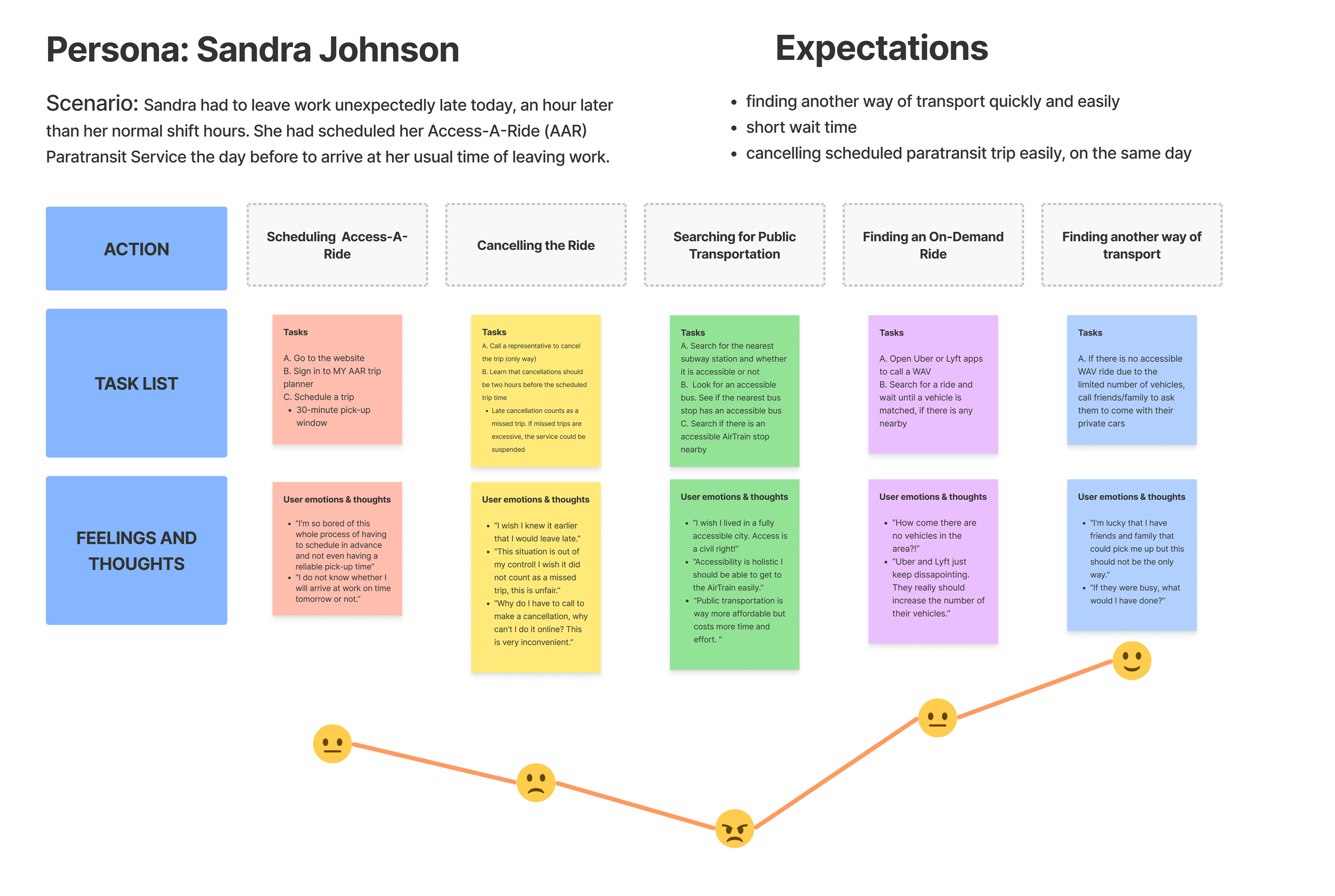
Analyzing the findings of the research, I created a point of view statement, user persona, user journey, and an empathy map that outline user needs, goals, and pain points. The problems that people with mobility issues encounter in their life impacts their sense of independence and completion of everyday activities. It becomes harder to find jobs, housing, and save money.
POV Statement
Sandra needs a way to transport effectively and safely because she wants to be on time and stress-free in her daily life and achieve a sense of independence.
User Persona
Further, I formulated a user persona based on insights, findings gathered from the research, and recurring themes that represent wheelchair users
User Journey
I then mapped out a user journey that relates to the user persona in a specific scenario. I made sure to address a series of steps, touchpoints, channels, and the emotional state of the user supplemented by quotes in each st
Empathy Map
Creating an empathy map further enabled me to deepen my understanding of the users and their problems and define potential functional requirements before ideating solutions.
User Persona
User Journey Map
Empathy Map
Stage 3: Ideate
How might we take action as a community to help those who are in need of mobility assistance in a meaningful way?
I brainstormed some ideas to create an app that empowers users with mobility problems, helps them to achieve a sense of independence, and alleviates their pain points. I wanted to make use of the power of social interaction and connectivity, and people's desire to create positive social impact and help each other. Thus, the application I had in mind would make use of peer-to-peer (P2P) services. I got inspired by an app called Sweatcoin, in which users accumulate “Sweatcoins” with their steps (10 steps = 1 Sweatcoin) to benefit from discounts/campaigns to purchase products and services. They can also donate to charities and organizations to contribute to a positive cause. Similarly, Movility would allow users to gain points as they travel in their daily life, which would be WheelPoints corresponding to miles traveled (by car, public transportation etc.). Since smartphones have the capability to detect whether the user is in a moving vehicle or not, the translation would be made accordingly. Able-bodied users can either choose to offer a ride to a person in need that requests a ride on their travel path (if they have a vehicle that would accommodate wheelchairs and if they have completed a training session) or choose to donate a Uber or a Lyft ride to those with mobility issues. This would be achieved through established partnerships with ride-sharing apps.
Solution Sketching
I sketched quick ideas based on the ideas that I had in mind. Initially, I thought of presenting two options to users who need assistance, in areas of transportation and shopping. In terms of terminology, I was debating between requester/caller/user vs. volunteer. In order to add to the social aspect of the app, I decided to include the “Connections” section which basically shows the interaction history between users who offer help and users who need help.
Low-fidelity Wireframes
I further developed initial sketches into low-fidelity digital wireframes, after receiving some feedback from my professor and classmates. I decided to exclude shopping assistance to narrow down the focus and put more emphasis on transportation, since there are other similar apps in the industry for task completion purposes. I used friendly language and decided to have people choose between “I need mobile assistance” vs. “I'm here to help.” Because wheelchair users are not the only target user group and people with visual and hearing impairments also have mobility issues, I included those options to choose from so that the application would adjust accordingly.
Initial Sketches
Low-Fidelity Wireframes
Stage 4: Develop
Branding and Design Decisions
Before moving to high-fidelity wireframes, I did some quick research and looked at existing applications, logos, and practices to decide on the color scheme and the fonts, overall the branding. In the context of the transportation industry, I found that yellow, blue and orange are abundantly used, which have meanings like optimism, trust, and efficiency, as indicated on the right. I decided on using alternating shades of blue and orange, as they are complementary colors and blue is also used in the medical field, typically associated with credibility, security, trust, professionalism, cleanliness, and calmness. These are values that are important to users and the goal of the application.
High-Fidelity Wireframes
Moving on to high-fidelity wireframes, I decided on the color scheme and the typography, as shown on the right. I made sure to check the color contrast ratio and the text and images have a high enough ratio to make the overall design accessible to everyone, including people with color blindness.
For visual icons, I made use of hand icons that give the application a warm and friendly feel, representing people who request mobility assistance and volunteers who want to "give a hand” by offering a ride or donating a ride. These hand icons are observed both on the initial screen and on the map.
The design is consistent and simplet, with call-to-action buttons being blue and selected elements turning orange as visual feedback. Rounded visual elements and UI elements like buttons and icons maintain the soft and friendly feel as well as the font (Nunito) which has rounded edges that adds modern simplicity. The logo of the brand is a wheel (also circular) with highlighted orange stripes/waves coming out, which symbolizes the "connectivity" idea behind the app that operates through peer-to-peer services. A small dot with expanding waves/lines is a recognized symbol for a Wi-Fi signal. Based on the feedback I received, I included a toggle switch that enables users to display themselves online or offline, which is a helpful feature for the operations of the app in order to match drivers/helpers with those in need of mobility assistance when they are available.
Landing Screen
Sign Up/ Log In Screen
Sign Up Screen for People Who Need Mobile Assistance
Home Screen for the Helpers/Drivers
Points Screen
Reflection
This project was a learning curve for me in terms of bringing an idea that creates a positive social impact to life. Although it was challenging at first to figure out the layout of multiple screens and the visual design, once I decided on the main branding and overall mood, it became easier to create more screens and maintain consistency. Starting with simple sketches and then translating them into low-fidelity wireframes and finally into high-fidelity wireframes as part of the design process was experimental and seeing how it evolved was rewarding. I kept making changes, editing the colors, icons, various features, and even the language throughout the development stage and realized even small changes do make a difference. For example, making the orange shade a little darker and the background blue lighter increased the contrast ratio and accessibility.


